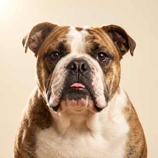
Watercolor is the softest medium we offer — loose washes, airy color, hopeful register. Best for nurseries, bedrooms, and family gifts. Free preview in about 40 seconds.
Watercolor is the medium people mean when they say a painting "breathes." Loose washes of color, unfilled paper showing through, brushstrokes that read as gesture rather than fill. It's the softest style in our catalog — and the one most families choose when the finished piece is for a bedroom, a nursery, or a gift.
What Watercolor looks like
Airy color that pools where the artist let it and lifts where they lifted the brush. Skin tones and fur tones show as washes rather than solid fills. Backgrounds fade to the paper. The overall register is warm, unhurried, and slightly imprecise in the way real watercolor is imprecise — every wash has an edge, every edge has a personality.
Where Renaissance carries centuries of formal portraiture, Watercolor carries something younger and more personal — the register of a hand-illustrated children's book, a wedding portrait, a card someone made for you.
Which pets look best in Watercolor
- GoldendoodlesSoft coat + warm tones = the format Watercolor was built for. Every curl reads as brushstroke.
- LabradoodlesFleece and wool coats catch the washes beautifully. Second-most-ordered breed for this style.
- Golden RetrieversAmber-to-copper coat range flatters watercolor's warm palette. Softens the formal Golden register.
Cats look wonderful in Watercolor — especially long-haired, tabbies, and Ragdolls where the coat texture rewards loose brushwork. Rabbits and small mammals are among the most-requested exotic Watercolor subjects; the softness of the medium matches the softness of the animal.
See your pet in Watercolor — free, in about 40 seconds.
Try the free preview →Which rooms Watercolor suits
- Bedrooms. The softness works with neutrals, pastels, and linens. Doesn't compete with the register of a room made for rest.
- Nurseries. The default for a family adding a first child. Warm, hopeful, character-forward.
- Kids' rooms. Softer than Pop Art but more colorful than Charcoal — the middle-register kids' portrait.
- Kitchens and breakfast nooks. Casual enough for daily traffic, personal enough to warm a room.
Watercolor is not the pick for a formal living room or corporate-adjacent office — the register reads too soft. For those, try Renaissance or Classic Oil.
How to get the best Watercolor portrait
Even, soft source light
Watercolor is a soft medium; it reads best from soft source photos. Window light, overcast outdoor shots, or open-shade daylight all give the paint room to breathe. Harsh sunlight or aggressive HDR photos push against the medium's grain.
Faces + a little context
Head-and-shoulders shots work — but Watercolor rewards a little context in the background (a bit of foliage, a hint of window, a soft blur of the room). Full-body outdoor shots are especially strong because the surroundings become part of the wash.
Skip the filters
Instagram filters and beauty modes shift the color balance in ways the paint model reads as "artistic intent" — you end up with weird tonal choices. Use the raw camera roll photo.
Framing a Watercolor portrait
Watercolor works well in almost every frame finish; three combinations are especially strong:
- Natural oak — the default warmth. Reads modern-hand-crafted, pairs with light woods and neutral walls.
- White — the airy match. Best for nurseries, bedrooms, and Scandinavian-adjacent rooms.
- Black — the graphic contrast. If you want the piece to punctuate a wall rather than blend into it.
All framed prints are museum-mounted with a snow-white mat behind acrylic glazing, made-to-order by our print partner Prodigi on 200gsm archival paper. Ships to the US & Canada in about 3-5 business days.
Common questions
Will the colors be soft or vibrant?
Both, in balance. Watercolor's specific character is that saturated colors sit next to loose washes — the eyes might be a sharp brown, the coat a soft fade. It's less saturated than Pop Art and more saturated than Charcoal.
Can I control how "loose" the watercolor is?
Yes — use the custom-prompt option in the studio. You can request "tight watercolor" for more control, "loose watercolor" for more gestural work, or "wet-on-wet watercolor" for the softest possible bleed.
Is Watercolor the right style for a memorial portrait?
It can be. Some families find Watercolor's softness easier to look at daily than a more literal medium; others prefer Charcoal's restraint or Classic Oil's warmth. See our memorial portrait guide for how families have chosen.
What's the difference between Watercolor and Impressionist?
Both are "soft" styles, but Impressionist works in oil with dappled light and broken brushwork (think Monet). Watercolor works on paper with washes and pooling color (think a modern illustrator). Impressionist is more textured; Watercolor is airier.
How much does a Watercolor portrait cost?
Preview is free. Downloadable file is $9.95. Framed prints run $179-$299 depending on size and frame finish. Every style is the same price.